1. Introduction to Data Visualization Tools
1) Why Build Visuals?
* for exploratory data analysis(EDA)
* communicate data clearly
* share unbiased representation of data
* use them to support recommendations to different stakeholders
* always remember
→ 'Less is more effective'
→ 'Less is more attractive'
→ 'Less is more impactive'
ex)

- simple / cleaner / less distracting / much easier to read -
2) Matplotlib
* Matplotlib Architecture
✋ 아래와 같이 크게 3가지의 layer로 구성되어 있다!
→ Scripting Layer & Artist Layer & Backend Layer

1> Backend Layer
- FigureCanvas: matplotlib.backend_bases.FigureCanvas
(encompasses the area onto which the figure is drawn)
- Renderer: matplotlib.backend_bases.Renderer
(knows how to draw on the FigureCanvas)
- Event: matplotlib.backend_bases.Event
(handles user inputs such as keyboard strokes and mouse clicks)
2> Artist Layer
→ comprised of one main object: Artist
- Titles, lines, tick labels, and images all correspond to individual Artist instances
- two types of Artist objects: Primitive (Line2D, Rectangle, Circle, and Text) + Composite (Axis, Tick, Axes, and Figure)
- each composite artist may contain other composite artists as well as primitive artists
3> Scripting Layer
→ comprised mainly of pyplot (a scripting interface that is lighter than the Artist Layer)
3) Basic Plotting with Matplotlib
* Matplotlib Backends
→ Inline
- you cannot modify a figure once it's rendered
(after rendering the figure (after plt.show()), there is no way for to add figure title or label its axes)
→ notebook
- it checks if active figure exists, any functions we call it will be active on the new figure
- if a figure doesn't exist, it renders a new figure
- we can freely add labels, title.. etc without the need to regenerate the figure
* Pandas
- has a built-in implementation of it
- plotting in Pandas is as simple as calling the plot function on a given pandas series & dataframe
4) Line Plot
= a type of a plot which displays information as a series of data points called 'markers' connected by straight line segments
- a basic type of chart common in many fields
- use line plot when have a continuous data set
- best suited for trend-based visualizations of data over a period of time
Q) Compare the trend of top 5 countries that contributed the most to immigration to Canada
A)
df_can.sort_values(by='Total', ascending=False, axis=0, inplace=True)

df_top5 = df_can.head(5)

df_top5 = df_top5[years].transpose()

df_top5.index = df_top5.index.map(int)
df_top5.plot(kind='line', figsize=(14, 8))

plt.title('Immigration Trend of Top 5 Countries')
plt.ylabel('Number of Immigrants')
plt.xlabel('Years')

plt.show()

2. Basic & Specialized Visualization Tools
1) Basic Visualization Tools
* Area Plot (Area Chart, Area Graph, Stacked Line plot)
(an extension of the line plot)
= a type of plot that depicts accumulated totals using numbers or percentages over time
- based on the line plot
- commonly used when trying to compare two or more quantities
👏 To produce a stacked area plot, each column must be all positive or all negative
(and NaN(not a number) values will be default to 0)
👏 to produce an unstacked plot, set parameter stacked to value False (area plots are stacked by default)
-1-
before making an area plot, make df_top5
import matplotlib as mpl
import matplotlib.pyplot as plt

df_can.sort_values(['Total'], ascending=False, axis=0, inplace=True)

# get the top 5 entries
df_top5 = df_can.head()

# transpose the dataframe
df_top5 = df_top5[years].transpose()

df_top5.head()

-2-
the unstacked plot (modifying transparency value - alpha)
df_top5.plot(kind='area',
             alpha=0.25,  # 0 - 1, default value alpha = 0.5
             stacked=False, # making a unstacked plot
             figsize=(20, 10))

plt.title('Immigration Trend of Top 5 Countries')
plt.ylabel('Number of Immigrants')
plt.xlabel('Years')

plt.show()

-3-
Two types of plotting - Scriptying Layer(procedural method)
*using matplotlib.pyplot as plt
👏use plt and add more elements by calling different methods procedurally 👏
(for example plt.title(...) to add title / plt.xlabel(...) to add label to the x-axis)
# Option 1: This is what we have been using so far
df_top5.plot(kind='area', alpha=0.35, figsize=(20, 10))
plt.title('Immigration trend of top 5 countries')
plt.ylabel('Number of immigrants')
plt.xlabel('Years')
-4-
Two types of plotting - Artist Layer(object oriented method)
*using Axes instance from Matplotlib(preferred!)
- use an Axes instance of the current plot and store it in a variable(ax)
- can add more elements by calling methods with a little change in syntax
* by adding set_ to the previous methods (for example, ax.set_title() or ax.set_xlabel())
- this option sometimes is more transparent and flexible to use for advanced plots
(in particular when having multiple plots)
# option 2: preferred option with more flexibility
ax = df_top5.plot(kind='area', alpha=0.35, figsize=(20, 10))

ax.set_title('Immigration Trend of Top 5 Countries')
ax.set_ylabel('Number of Immigrants')
ax.set_xlabel('Years')
* Histogram
= a way of representing the frequency distribution of a variable
- partitions the x-axis into bins - assigns each data point in our dataset to a bin
(counts the number of data points that have been assigned to each bin)
- y-axis is the frequency or the number of data points in each bin
-1- np.histogram (returns two values: count, bin_edges)
count, bin_edges = np.histogram(df_can['2013'])

print(count) # frequency count
print(bin_edges) # bin ranges, default = 10 bins
ans) [178 11 1 2 0 0 0 0 1 2] [ 0. 3412.9 6825.8 10238.7 13651.6 17064.5 20477.4 23890.3 27303.2 30716.1 34129. ]
(by default, the histogram method breaks up the dataset into 10 bins)
(178 countires are in btw 0 ~ 3412.9 immigrants /
11 countries are in btw 3412.9 ~ 6825.8 immigrants /
1 country is in 6285.8 ~ 10238.7 immigrants)
df_can['2013'].plot(kind='hist', figsize=(8, 5))

# add a title to the histogram
plt.title('Histogram of Immigration from 195 Countries in 2013')
# add y-label
plt.ylabel('Number of Countries')
# add x-label
plt.xlabel('Number of Immigrants')

plt.show()

-2- Q) x-labels do not match with the bin size
A) can be fixed by passing in a xticks keyword (contains the list of the bin sizes)
# 'bin_edges' is a list of bin intervals
count, bin_edges = np.histogram(df_can['2013'])

df_can['2013'].plot(kind='hist', figsize=(8, 5), xticks=bin_edges)

plt.title('Histogram of Immigration from 195 countries in 2013') # add a title to the histogram
plt.ylabel('Number of Countries') # add y-label
plt.xlabel('Number of Immigrants') # add x-label

plt.show()

-3- Multiple histograms on the same plot
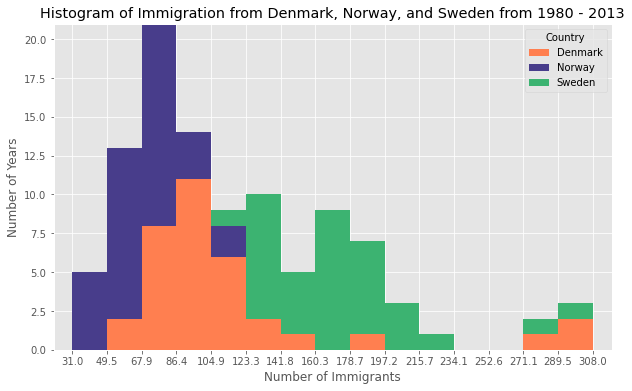
Q) What is the immigration distribution for Denmark, Norway, and Sweden for years 1980 - 2013?
A)
df_can.loc[['Denmark', 'Norway', 'Sweden'], years]

df_t = df_can.loc[['Denmark', 'Norway', 'Sweden'], years].transpose()

count, bin_edges = np.histogram(df_t, 15)
xmin = bin_edges[0] - 10   #  first bin value is 31.0, adding buffer of 10 for aesthetic purposes
xmax = bin_edges[-1] + 10  #  last bin value is 308.0, adding buffer of 10 for aesthetic purposes

# stacked Histogram
df_t.plot(kind='hist',
          figsize=(10, 6),
          bins=15,
          xticks=bin_edges,
          color=['coral', 'darkslateblue', 'mediumseagreen'],
          stacked=True,
          xlim=(xmin, xmax)
         )

plt.title('Histogram of Immigration from Denmark, Norway, and Sweden from 1980 - 2013')
plt.ylabel('Number of Years')
plt.xlabel('Number of Immigrants')

plt.show()
* Bar Charts (Bar Graph)
- unlike a histogram, a bar chart is commonly used to compare the values of a variable at a give point in time
- a type of plot where the length of each bar is proportional to the value of the item that it represents
(the length of the bars represents the magnitude/size of the feature/variable)
- usually represent numerical & categorical variables grouped in intervals
<Vertical bar plot> (kind=bar)
- x-axis is used for labeling, the length of the bars on the y-axis corresponds to the magnitude of the variable being measured
- particularly useful in analyzing time series data
- disadvantage) lack space for text labelling at the foot of each bar
Q) Compare the number of Icelandic immigrants (country = 'Iceland') to Canada from year 1980 to 2013
A)
-1- get the data
-2- plot data (+ annotating a text & an arrow)
🤳 .annotate docu() 🤳
matplotlib.pyplot.annotate(text, xy, *args, **kwargs)
df_iceland = df_can.loc['Iceland', years]

df_iceland.plot(kind='bar', figsize=(10, 6), rot=90)

plt.xlabel('Year')
plt.ylabel('Number of Immigrants')
plt.title('Icelandic Immigrants to Canada from 1980 to 2013')

# Annotate arrow
plt.annotate('',  # s: str. will leave it blank for no text
             xy=(32, 70),  # place head of the arrow at point (year 2012 , pop 70)
             xytext=(28, 20),  # place base of the arrow at point (year 2008 , pop 20)
             xycoords='data',  # will use the coordinate system of the object being annotated
             arrowprops=dict(arrowstyle='->', connectionstyle='arc3', color='blue', lw=2)
             )

# Annotate Text
plt.annotate('2008 - 2011 Financial Crisis',  # text to display
             xy=(28, 30),  # start the text at at point (year 2008 , pop 30)
             rotation=72.5,  # based on trial and error to match the arrow
             va='bottom',  # want the text to be vertically 'bottom' aligned
             ha='left',  # want the text to be horizontally 'left' algned.
             )

plt.show()

<Horizontal bar plot> (kind=barh)
- sometimes it is more practical to represent the data horizontally, especially if need more room for labelling the bars
- y-axis is used for labelling, the length of the bars on the x-axis corresponds to the magnitude of the variable being measured
- there is more room on the y-axis to label categorical variables
Q) Create a horizontal bar plot showing the total number of immigrants to Canada from the top 15 countries, for the period 1980-2013
A)
df_can.sort_values(by='Total', ascending=True, inplace=True)
df_top15 = df_can['Total'].tail(15)

df_top15.plot(kind='barh', figsize=(12, 12), color='steelblue')
plt.xlabel('Number of Immigrants')
plt.title('Top 15 Conuntries Contributing to the Immigration to Canada between 1980 - 2013')

# annotate value labels to each country
for index, value in enumerate(df_top15):
    label = format(int(value), ',') # format int with commas

# place text at the end of bar (subtracting 47000 from x, and 0.1 from y to make it fit within the bar)
plt.annotate(label, xy=(value - 47000, index - 0.10), color='white')

plt.show()

2) Special Visualization Tools
* Pie Chart
= a circular statistical graphic divided into slices to illustrate numerical proportion
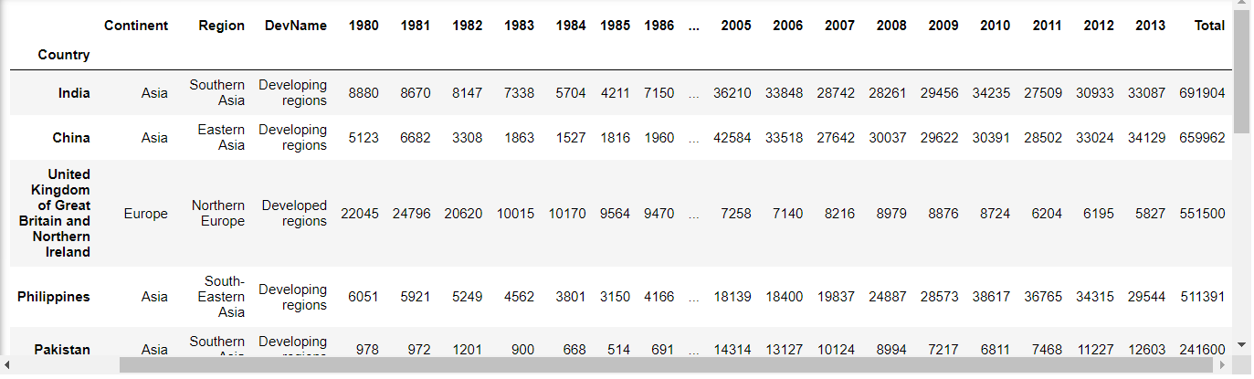
- before making a pie chart) make df_continents using groupby() -
df_continents = df_canada.groupby('Continent', axis = 0).sum()
+ groupby() function
- used pandas groupby method to summarize the immigration data by Continent.
- the general process of grouby involves following three steps: split -> apply -> combine

df_continents.head()

- now visualize using pie chart
import matplotlib as mpl
import matplotlib.pyplot as plt

colors_list = ['gold', 'yellowgreen', 'lightcoral', 'lightskyblue', 'lightgreen', 'pink']
explode_list = [0.1, 0, 0, 0, 0.1, 0.1] # ratio for each continent with which to offset each wedge.

df_continents['Total'].plot(kind='pie',
                            figsize=(15, 6),
                            autopct='%1.1f%%',
                            startangle=90,
                            shadow=True,
                            labels=None,         # turn off labels on pie chart
                            pctdistance=1.12,    # the ratio between the center of each pie slice and the start of the text generated by autopct
                            colors=colors_list,  # add custom colors
                            explode=explode_list # 'explode' lowest 3 continents
                            )

# scale the title up by 12% to match pctdistance
plt.title('Immigration to Canada by Continent [1980 - 2013]', y=1.12)

plt.axis('equal')

# add legend
plt.legend(labels=df_continents.index, loc='upper left')

plt.show()
- autopct: a string or function used to label the wedges with their numeric value. The label will be placed inside the wedge. If it is a format string, the label will be fmt%pct
- startangle: rotates the start of the pie chart by angle degrees counterclockwise from the x-axis
- shadow: draws a shadow beneath the pie (to give a 3D feel)
- legend: removing the text labels and add it as a separate legend using plt.legend()
- pctdistance: the percentages to sit just outside the pie chart
- colors: custom set of colors
- explode: explode some slices (the lowest three continents in here - Africa, NA, LA & Caribbean)

* Box Plot
= a way of statistically representing the distribution of given data through 5 main dimensions
(minimum, first quartile, median, third quartile, maximum)
box plot (+seaborn)
* 저번 EDA 개념 포스팅에서 EDA가 무엇인지 알아보았고, data 종류별 & 상황별 적절한 시각화 예에 대해서 공부했다. https://sh-avid-learner.tistory.com/entry/EDA-Exploratory-Data-Analysis EDA - Explorat..
sh-avid-learner.tistory.com
- In order to be an outlier, the data value must be:
Outlier 1 > Q3(third quartile) + (1.5*IQR) = Q3 + 1.5*(Q3-Q1) = 2.5*Q3 - 1.5Q1
Outlier 2 < Q1(first quartile) - (1.5*IQR) = Q1 - 1.5*(Q3-Q1) = 2.5*Q1 - 1.5*Q3

import matplotlib as mpl
import matplotlib.pyplot as plt

df_japan = df_canada.loc[['Japan'],years].transpose()

df_japan.plot(kind='box')

plt.title('Box plot of Japanese Immigrants from 1980-2013')
plt.ylabel('Number of Immigrants')

plt.show()

- One of the key benefits of box plots is comparing the distribution of multiple datasets
df_CI = df_can.loc[['China','India'],years].transpose()

df_CI.plot(kind='box', figsize=(10, 7))

plt.title('Box plots of Immigrants from China and India (1980 - 2013)')
plt.ylabel('Number of Immigrants')

plt.show()

- can also make horizontal box plot using vert=False & can adjust the color of a box plot using color
# horizontal box plots
df_CI.plot(kind='box', figsize=(10, 7), color='blue', vert=False)

plt.title('Box plots of Immigrants from China and India (1980 - 2013)')
plt.xlabel('Number of Immigrants')

plt.show()

🙌 making subplots
→ To visualize multiple plots together, we can create a figure (overall canvas) and divide it into subplots, each containing a plot. With subplots, we usually work with the artist layer instead of the scripting layer.
fig = plt.figure() # create figure
ax = fig.add_subplot(nrows, ncols, plot_number) # create subplots
→ nrows and ncols are used to notionally split the figure into (nrows * ncols) sub-axes
→ plot_number is used to identify the particular subplot that this function is to create within the notional grid. plot_number starts at 1, increments across rows first and has a maximum of nrows * ncols

fig = plt.figure() # create figure

ax0 = fig.add_subplot(1, 2, 1) # add subplot 1 (1 row, 2 columns, first plot)
ax1 = fig.add_subplot(1, 2, 2) # add subplot 2 (1 row, 2 columns, second plot). See tip below**

# Subplot 1: Box plot
df_CI.plot(kind='box', color='blue', vert=False, figsize=(20, 6), ax=ax0) # add to subplot 1
ax0.set_title('Box Plots of Immigrants from China and India (1980 - 2013)')
ax0.set_xlabel('Number of Immigrants')
ax0.set_ylabel('Countries')

# Subplot 2: Line plot
df_CI.plot(kind='line', figsize=(20, 6), ax=ax1) # add to subplot 2
ax1.set_title ('Line Plots of Immigrants from China and India (1980 - 2013)')
ax1.set_ylabel('Number of Immigrants')
ax1.set_xlabel('Years')

plt.show()

tip regarding subplot convention
subplot(211) == subplot(2, 1, 1) #just 3 digits are the same for convenience
+++ Advanced)
Q) Create a box plot to visualize the distribution of the top 15 countries (based on total immigration) grouped by the decades 1980s, 1990s, and 2000s
-1- Get the dataset. Get the top 15 countries based on Total immigrant population.
df_top15 = df_can.sort_values(['Total'], ascending=False, axis=0).head(15)
-2- Create a list of all years in decades 80's, 90's, and 00's
years_80s = list(map(str, range(1980, 1990)))
years_90s = list(map(str, range(1990, 2000)))
years_00s = list(map(str, range(2000, 2010)))
-3- Slice the original dataframe df_can to create a series for each decade and sum across all years for each country
df_80s = df_top15.loc[:, years_80s].sum(axis=1)
df_90s = df_top15.loc[:, years_90s].sum(axis=1)
df_00s = df_top15.loc[:, years_00s].sum(axis=1)

#[:,'column_name'] = apply for all columns named 'column_name'
-4- Merge the three series into a new data frame
new_df = pd.DataFrame({'1980s': df_80s, '1990s': df_90s, '2000s':df_00s})
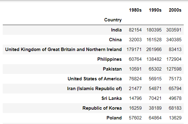
- 5- Visualize new_df using box plot
new_df.plot(kind='box',figsize=(10,6))

plt.title('Immigration from top 15 countries for decades 80s, 90s and 2000s')

plt.show()

* Scatter plot
= a type of plot that displays values pertaining to typically two variables against each other
- usually it is a dependent variable to be plotted against an independent variable in order to determine if any correlation btw two variables exists
- with scatter plots, we also need to pass the variable to be plotted on the horizontal axis (as the x-parameter) & the vertical axis (as the y-parameter)
- The data in a scatter plot is considered to express a trend. With further analysis using tools like regression, we can mathematically calculate this relationship and use it to predict trends outside the dataset.
Q) Visualize the trend of total immigration to Canada (all countries combined) for the years 1980 - 2013 & try to plot a linear line of best fit, and use it to predict the number of immigrants in 2015.
A)
-1- Get the dataset, and make the final dataframe including only 'year' & 'total' column
(have to change the 'year' to type 'int' - for regression)
# we can use the sum() method to get the total population per year
df_tot = pd.DataFrame(df_can[years].sum(axis=0))

# change the years to type int (useful for regression later on)
df_tot.index = map(int, df_tot.index)

# reset the index to put in back in as a column in the df_tot dataframe
df_tot.reset_index(inplace = True)

# rename columns
df_tot.columns = ['year', 'total']

# view the final dataframe
df_tot.head()

-2- Plot the data - create a scatterplot
df_tot.plot(kind='scatter', x='year', y='total', figsize=(10, 6), color='darkblue')

plt.title('Total Immigration to Canada from 1980 - 2013')
plt.xlabel('Year')
plt.ylabel('Number of Immigrants')

plt.show()

- the scatter plot clearly depicts an overall rising trend of immigration with time
-3- Plot a linear line of best fit (use Numpy's polyfit() method)
(deg = 1 means linear line)
x = df_tot['year']      # year on x-axis
y = df_tot['total']     # total on y-axis
fit = np.polyfit(x, y, deg=1)
-4- Plot the regression line on the scatter plot
df_tot.plot(kind='scatter', x='year', y='total', figsize=(10, 6), color='darkblue')

plt.title('Total Immigration to Canada from 1980 - 2013')
plt.xlabel('Year')
plt.ylabel('Number of Immigrants')

# plot line of best fit
plt.plot(x, fit[0] * x + fit[1], color='red') # recall that x is the Years
plt.annotate('y={0:.0f} x + {1:.0f}'.format(fit[0], fit[1]), xy=(2000, 150000))

plt.show()

# print out the line of best fit
'No. Immigrants = {0:.0f} * Year + {1:.0f}'.format(fit[0], fit[1])

-5- Estimate the number of immigrants in 2015
No. Immigrants = 5567 * Year - 10926195
No. Immigrants = 5567 * 2015 - 10926195
No. Immigrants = 291,310
→ when compared to the actual from Citizenship and Immigration Canada's(CIC) 2016 Annual Report, Canada accepted 271,845 immigrants in 2015. Estimated value of 291,310 is within 7% of the actual number, which pretty good considering our original data came from UN.
* Bubble Plot
= a variation of the scatter plot that displays three dimensions of data (x,y,z)
- the data points are replaced with bubbles, and the size of the bubble is determined by the third variable, z (known as weight)
- in matplotlib, can pass in an array or scalar to the parameter s to plot()
Q) Analyzing the effect of Argentina's great depression (1998-2002). Compare Argentina's immigration to that of it's neighbour Brazil. Use a bubble plot of immigration from Brazil and Argentina for the years 1980 - 2013. Set the weights for the bubble as the normalized value of the population for each year
-1- Get the data for Brazil & Argentina. Will convert the Years to type int and include it in the df
# transposed dataframe
df_can_t = df_can[years].transpose()

# cast the Years (the index) to type int
df_can_t.index = map(int, df_can_t.index)

# let's label the index. This will automatically be the column name when we reset the index
df_can_t.index.name = 'Year'

# reset index to bring the Year in as a column
df_can_t.reset_index(inplace=True)
-2- Create the normalized weights (will use feature scaling to bring all values into the range [0,1])

# normalize Brazil data
norm_brazil = (df_can_t['Brazil'] - df_can_t['Brazil'].min()) / (df_can_t['Brazil'].max() - df_can_t['Brazil'].min())

# normalize Argentina data
norm_argentina = (df_can_t['Argentina'] - df_can_t['Argentina'].min()) / (df_can_t['Argentina'].max() - df_can_t['Argentina'].min())
-3- Plot the data
→ to plot two different scatter plots in one plot, include the axes one plot into the other by passing it via the ax parameter
→ will also pass in the weights using the s parameter
(normalized weights won't be visible on the plot (ranges between 0 -1) - multiply weights by 2000 & add 10 to compensate for the min value (which has 0 weight and therefore scale with x2000)
# Brazil
ax0 = df_can_t.plot(kind='scatter',
                    x='Year',
                    y='Brazil',
                    figsize=(14, 8),
                    alpha=0.5,  # transparency
                    color='green',
                    s=norm_brazil * 2000 + 10,  # pass in weights
                    xlim=(1975, 2015)
                    )

# Argentina
ax1 = df_can_t.plot(kind='scatter',
                    x='Year',
                    y='Argentina',
                    alpha=0.5,
                    color="blue",
                    s=norm_argentina * 2000 + 10,
                    ax=ax0
                    )

ax0.set_ylabel('Number of Immigrants')
ax0.set_title('Immigration from Brazil and Argentina from 1980 to 2013')
ax0.legend(['Brazil', 'Argentina'], loc='upper left', fontsize='x-large')

-4- Conclusion (EDA example)
- From the plot above, we can see a corresponding increase in immigration from Argentina during the 1998 - 2002 great depression. We can also observe a similar spike around 1985 to 1993. In fact, Argentina had suffered a great depression from 1974 to 1990, just before the onset of 1998 - 2002 great depression.
- On a similar note, Brazil suffered the Samba Effect where the Brazilian real (currency) dropped nearly 35% in 1999. There was a fear of a South American financial crisis as many South American countries were heavily dependent on industrial exports from Brazil. The Brazilian government subsequently adopted an austerity program, and the economy slowly recovered over the years, culminating in a surge in 2010. The immigration data reflect these events.
** 썸넬 출처) https://animationvisarts.com/ibm-logo-meaning-history-evolution/
'Visualizations > Fundamentals' 카테고리의 다른 글
| Seaborn vs Matplotlib (0) | 2022.03.26 |
|---|

댓글