* Intro
"Data visualization is part art and part science. The challenge is to get the art right without getting the science wrong and vice versa. A data visualization first and foremost has to accurately convey the data. It must not mislead or distort. If one number is twice as large as another, but in the visualization they look to be about the same, then the visualization is wrong. At the same time, a data visualization should be aesthetically pleasing. Good visual presentations tend to enhance the message of the visualization. If a figure contains jarring colors, imbalanced visual elements, or other features that distract, then the viewer will find it harder to inspect the figure and interpret it correctly."
1> aesthetics & data types (visualization)
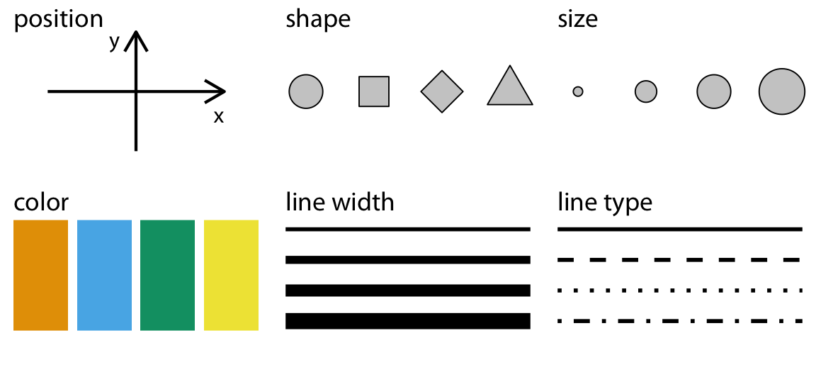
[1] Aesthetics
* Aesthetics describe every aspect of a given graphical element. A critical component of every graphical element is of course its position, which describes where the element is located. In standard 2d graphics, we describe positions by an x and y value, but other coordinate systems and one- or three-dimensional visualizations are possible. Next, all graphical elements have a shape, a size, and a color. Even if we are preparing a black-and-white drawing, graphical elements need to have a color to be visible, for example black if the background is white or white if the background is black. Finally, to the extent we are using lines to visualize data, these lines may have different widths or dash–dot patterns. There are many other aesthetics. For example, if we want to display text, we may have to specify font family, font face, and font size, and if graphical objects overlap, we may have to specify whether they are partially transparent.
- many aesthetics -
[2] data types
🤚 those are the types of variables encountered in typical data visualization scenarios (↓)
* 저번 EDA 포스팅에서 data type에 따른 EDA 방법 잠깐 다룸
EDA - Exploratory Data Analysis
1. concepts & goals → 탐색적 데이터 분석 - 수집한 데이터를 본격적으로 분석하기 전에 자료를 직관적으로 바라보는 과정이 필요한데, 이때 EDA를 사용한다 - 데이터 분석의 한 종류로 복잡한 모
sh-avid-learner.tistory.com
- continuous & discrete으로 나누는 게 더 정확하다 생각 -
(↓위에서 다룬 4가지 data type 외 numerical discrete + date/time + text type 포함)
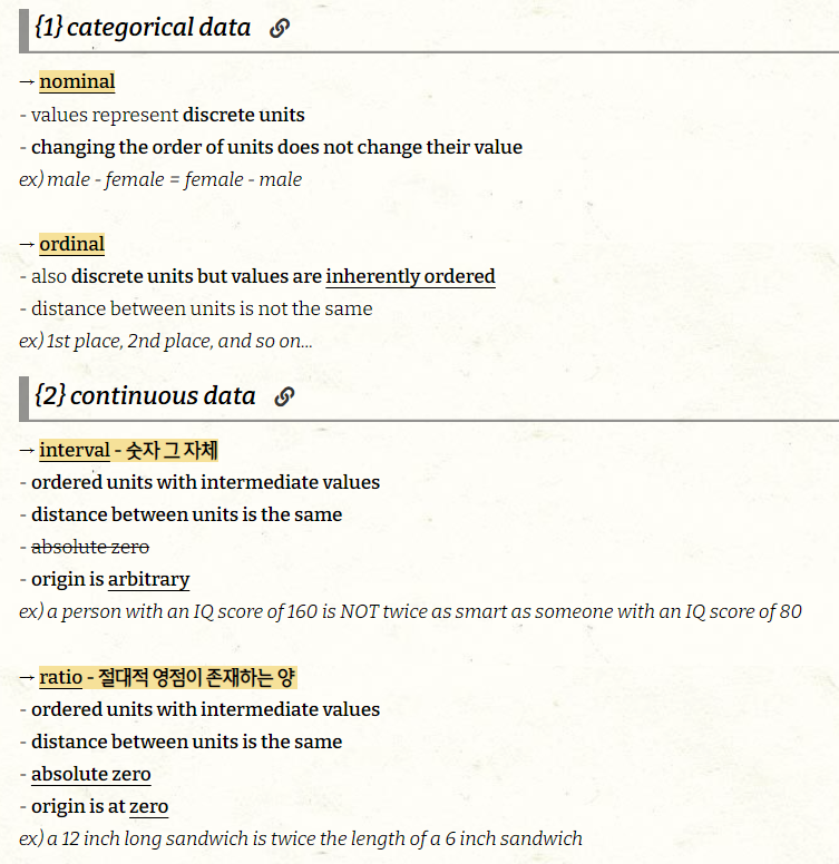
| type of variable | examples | appropriate scale | description |
| quantitative - interval+ratio (numerical continuous) |
1.3 5.7 83 $10^2$ | continuous | arbitrary numerical values can be integers, rational numbers, real numbers |
| quantitative (numerical discrete) |
1,2,3,4 | discrete | not necessarily integers. Numbers in discrete units |
| qualitative (categorical unordered; nominal) |
dog, cat, fish | discrete | Categories without order. These are discrete and unique categories that have no inherent order. These variables are also called factors |
| qualitative (categorical ordered; ordinal) |
good, fair, poor | discrete | Categories with order. These are discrete and unique categories with an order. For example, “fair” always lies between “good” and “poor”. These variables are also called ordered factors. |
| date / time | Feb. 9 2022, 1:38pm | continuous / discrete | Specific days and/or times. Also generic dates, such as July 4 or Dec. 25 (without year). |
| text | welcome to visual world | none / discrete | Free-form text. Can be treated as categorical if needed. |
(examples)
- First 12 rows of a dataset listing daily temperature normals for four weather stations. Data source: NOAA. -
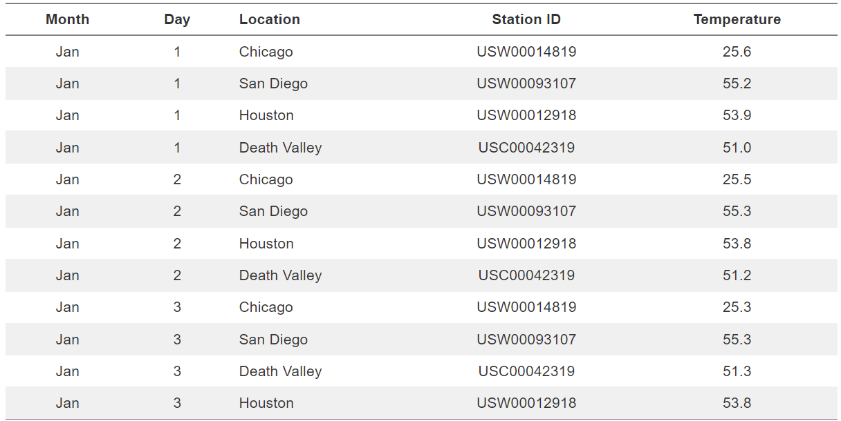
['Month'] = qualitative - categorical ordered values
['Day'] = quantitative - numerical discrete values
['Location'] = qualitative - categorical unordered values
['Station ID'] = qualitative - categorical unordered values
['Temparatue'] = quantative - numerical continuous values
2> Scales
* To map data values onto aesthetics, we need to specify which data values correspond to which specific aesthetics values. For example, if our graphic has an x axis, then we need to specify which data values fall onto particular positions along this axis. Similarly, we may need to specify which data values are represented by particular shapes or colors. This mapping between data values and aesthetics values is created via scales. A scale defines a unique mapping between data and aesthetics. Importantly, a scale must be one-to-one, such that for each specific data value there is exactly one aesthetics value and vice versa. If a scale isn’t one-to-one, then the data visualization becomes ambiguous.
(examples)

→ Fuel efficiency versus displacement, for 32 cars (1973–74 models). This figure uses five separate scales to represent data: (i) the x axis (displacement); (ii) the y axis (fuel efficiency); (iii) the color of the data points (power); (iv) the size of the data points (weight); and (v) the shape of the data points (number of cylinders). Four of the five variables displayed (displacement, fuel efficiency, power, and weight) are numerical continuous. The remaining one (number of cylinders) can be considered to be either numerical discrete or qualitative ordered. Data source: Motor Trend, 1974.
> References
- Stone, M., D. Albers Szafir, and V. Setlur. 2014. “An Engineering Model for Color Difference as a Function of Size.” In 22nd Color and Imaging Conference. Society for Imaging Science and Technology.
- https://clauswilke.com/dataviz/aesthetic-mapping.html
✋ 이 책의 모든 내용은 <Fundamentals of Data Visualization(Claus O.Wilke)>에 귀속.
**출처) https://clauswilke.com/dataviz/introduction.html
'Visualizations > Fundamentals of DV by Claus O. Wilke' 카테고리의 다른 글
| Color Scales (source from <Fundamentals of DV by Claus O.Wilke>) (2) | 2022.04.18 |
|---|---|
| Coordinate Systems & Axes (source from <Fundamentals of DV by Claus O.Wilke>) (0) | 2022.04.09 |

댓글