☆ THREE fundamental use cases for color in data visualizations ☆
1. as a tool to DISTINGUISH 👐
→ 'distinguishing discrete items or groups that do not have an intrinsic order, such as different countries on a map or different manufacturers of a certain product'
👉 data를 서로 구분하는 용도로 색을 쓸 때는 data 간에 내재된 순서가 없을 경우이다. 순서가 존재한다면 순서가 가까운 data 간에 좀 더 유사한 색을 부여해야 하므로 data간에 서로 영향이 없을 경우 색을 고를 때 한정한다!
👉 이럴 때, 우리는 qualitative color scale을 사용!
① 'contains a finite set of specific colors that are chosen to look clearly distinct from each other while also being equivalent to each other' → 무한한 색의 종류가 아닌 한정된 색들로 모여 있는 set이며, 색상 간 clear하게 구분됨
②''no one color should stand out relative to the others' → 색상 간 모두 동등하게, 즉 그 어떤 색도 튀어서는 안됨
③ ''the colors should not create the impression of an order, as would be the case with a sequence of colors that get successively lighter. Such colors would create an apparent order among the items being colored, which by definition have no order.' → 서로 순서가 내재된 것처럼 보이는 색상들이 있어서는 안됨. 즉 색상은 비슷한, 좀 더 연하고 진한 색상들이 있어서는 안됨
- qualitative color scale 예시 -

> qualitative color scale을 사용한 data visualization 예시를 보자.

↑ 미국의 네 지역 <West, South, Midwest, Northeast> 간에 서로 내재된 순서도 없는, 서로 명백한 discrete한 속성을 가지므로 해당 저자는 Okable Ito qualitative color scale을 사용하여 색상을 지정했다. 이렇게 qualitative color scale을 사용하니 어떤 data가 해당 지역에 속하는 지 한 눈에 들어옴!
2. to REPRESENT data values 💪
→ 'sequential color scale' 사용
→ 'Such a scale contains a sequence of colors that clearly indicate (i) which values are larger or smaller than which other ones and (ii) how distant two specific values are from each other. The second point implies that the color scale needs to be perceived to vary uniformly across its entire range.'
① sequential하기 때문에 어떤 value가 더 큰 값을 가진다면 해당 value는 더 진하게 표시될 것이다. value의 크기에 따라 색상의 짙고 얕음이 달라진다.
② 두 value간의 차이가 좀 더 작은, 즉 거리가 서로 가까운 value들은 색상의 차이가 더 없게 표현해야 하므로, 전체 색상 범위를 놓고 봤을 때 색상 변화가 균일하게 이루어져야 한다.
③ single hue - 한 종류의 색상을 가지고 짙고 옅음으로 표현하는 경우가 일반적이다. / 하지만 multiple hues를 이용하여 표현도 가능하다. 이럴 때는 자연세계에서 보이는 색 종류의 변화를 이용해 표현하는 경우가 많다.
- sequential color scale 예시 -

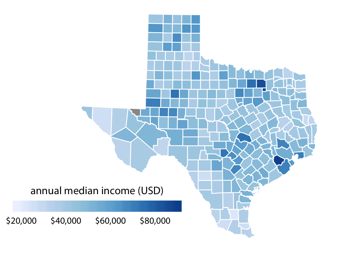
> 특히 지정학적 data를 이용해 각 지역별 data의 크고 작음을 'sequential color scale'을 이용해 map에서 표현하는 경우가 많은 데 아래의 예시를 보자. 이런 map을 choropleth map이라고 한다
- 어디 지역이 적게 벌고 많이 버는 지 '색상의 농도'를 통해 한 눈에 알 수 있음! -
🤚 여기서! 우리는 한 기준에 의해서만 색상 농도가 짙어지고 옅음을 표현하는 것이 아닌, 양 방향, 즉 예를 들면 한 지점에서 positive와 negative한 두 방향으로 뻗어나가는 data를 표현하고 싶을 때가 있다. 이럴 때는 중간 지점 mid point에 제일 옅은 색상을 두고 이 point를 기점으로 점점 positive & negative한 data로 뻗어나가면서 다른 종류의 색으로 각각 짙어지게 표현하는 color scale을 선택한다.
(diverging color scale이라 부름)
''In some cases, we need to visualize the deviation of data values in one of two directions relative to a neutral midpoint. One straightforward example is a dataset containing both positive and negative numbers. We may want to show those with different colors, so that it is immediately obvious whether a value is positive or negative as well as how far in either direction it deviates from zero. The appropriate color scale in this situation is a diverging color scale. We can think of a diverging scale as two sequential scales stiched together at a common midpoint, which usually is represented by a light color. Diverging scales need to be balanced, so that the progression from light colors in the center to dark colors on the outside is approximately the same in either direction. Otherwise, the perceived magnitude of a data value would depend on whether it fell above or below the midpoint value.'
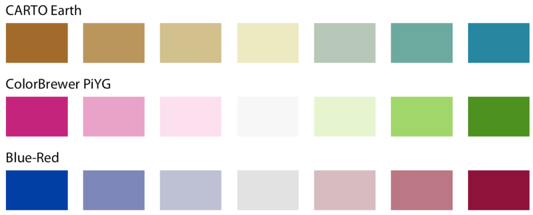
- sequential color scale - diverging color scale 예시 -
> positive & negative 뿐만 아니라, 실제 데이터 시각화할 때 이 scale은 어떤 때 쓰이냐면.. 중간 지점은 중요하지 않은데, 양 극단의 data 내용을 알려주고 싶을 때 해당 시각화를 사용한다. 아래 시각화 예시를 참고하자
- 밤색 지역은 백인이 거의 없고, 청색 지역은 백인 위주라는 두 가지 의미가 명백히 전달된다. -
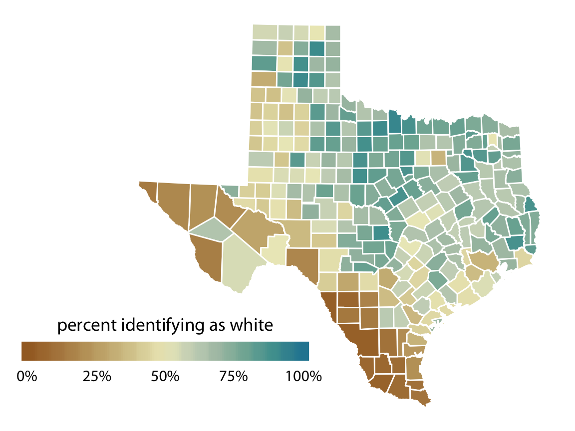
↑ 우리는 백인 인구 비율이 50% 중간인 지역에는 큰 관심이 없다. 반면에 백인이 거의 없는 지역이거나 & 백인 위주의 지역 - 즉 양 극단인 data에 관심이 많으므로, 이럴 때 diverging color scale (sequential)을 사용할 수 있다는 점! 알아두자.
3. to HIGHLIGHT ❗
→ 'There may be specific categories or values in the dataset that carry key information about the story we want to tell, and we can strengthen the story by emphasizing the relevant figure elements to the reader. An easy way to achieve this emphasis is to color these figure elements in a color or set of colors that vividly stand out against the rest of the figure. This effect can be achieved with accent color scales, which are color scales that contain both a set of subdued colors and a matching set of stronger, darker, and/or more saturated colors'
👉 주요 정보만 강조하고 싶을 때 색상을 사용하기도 한다. 이 때는 accent color scales를 사용할 수 있는데, 해당 scale의 색상들에는 옅은 색상들과 농도를 높인 색상들로 구성되어 있다.
- accent color scale 예시 -

> 이 때, ①기준이 되는 baseline color들은 상대적으로 옅게 표시하고 강조하고 싶은 data에만 색상을 진하게 표시할 수 있다. 아니면 ②baseline color들은 모두 색상을 없애고 강조하고 싶은 data에만 진한 색상을 입힐 수도 있다.
- (하단) 왼쪽 ① / 오른쪽 ② -

- 색상 정리 끝! -
-- 위에서 언급한 다양한 color scale의 python 시각화 방법은 추후 포스팅 예정 --
* 모든 내용 출처 - 시각화의 정석 'fundamentals of data visualizations' - Claus 아저씨 🧔🥰 https://clauswilke.com/dataviz/color-basics.html#ref-ColorBrewer
* choropleth map - https://en.wikipedia.org/wiki/Choropleth_map
* 출처) Brewer, Cynthia A. 2017. “ColorBrewer 2.0. Color Advice for Cartography.”
- 색상지원 https://colorbrewer2.org/#type=sequential&scheme=BuGn&n=3

댓글