* 저번 EDA 개념 포스팅에서 EDA가 무엇인지 알아보았고, data 종류별 & 상황별 적절한 시각화 예에 대해서 공부했다.
https://sh-avid-learner.tistory.com/entry/EDA-Exploratory-Data-Analysis
EDA - Exploratory Data Analysis
1. concepts & goals → 탐색적 데이터 분석 - 수집한 데이터를 본격적으로 분석하기 전에 자료를 직관적으로 바라보는 과정이 필요한데, 이때 EDA를 사용한다 - 데이터 분석의 한 종류로 복잡한 모
sh-avid-learner.tistory.com
- 저번 EDA 포스팅 (IQR, outlier 등등 여러 수치를 알 수 있지만, mode는 알 수 없음) -

→ 즉 unimodal distribution을 갖는 continuous variable의 경우 box plot이 제일 적절하다고 정리할 수 있다.
(bimodal의 경우 histogram - 즉 상황에 따라 box plot vs histogram 사용하기)
(cf - unimodal distribution - 단봉분포로, peak mode가 한 개인 분포 / bimodal distribution - peak mode가 두 개인 분포)
→ box plot 구성요소
- outliers - minimum - Q1 - median - Q3 - maximum - outliers (왼쪽부터) -

-시각화 개요-
※ data는 seaborn 내장 iris data
※ sepal_length, sepal_width, petal_length, petal_width는 모두 continuous variable(interval)이며 box plot & violin plot에 사용 가능
※ 총 세 개의 species(setosa, virginica, versicolor) 각각의 꽃받침 길이&넓이, 꽃잎 길이&넓이 4개의 분포(unimodal distribution)를 단 한 개의 box plot으로 확인하고자 함!
※ melt함수를 사용해 tidy data로 만들어 두 개 이상의 column이 한 번에 시각화 되게끔 준비!
iris_melted = iris.melt(id_vars='species',value_vars=['sepal_length','sepal_width','petal_length','petal_width'])
※ 시각화 library는 seaborn 사용! (그 외 plotly 등 여러 library가 있지만 seaborn 내장 data이기도 하니 seaborn 한정 사용)
※ (seaborn 시각화에 앞서) 1. set_theme() 메소드로 seaborn 시각화 기본설정하기
sns.set_theme(context='notebook', style='darkgrid', palette='deep', font='sans-serif', font_scale=1, color_codes=True, rc=None)
→ context & style param) seaborn 시각화 테마 설정
→ palette & color_codes) seaborn 시각화 칼라 설정 (여러 종류의 palette이 존재하고 해당 palette을 적용시킨다면 color_codes 값 True
→ font & font_scale) 글자 종류 및 크기 설정
→ rc) overriding할 dict형태 인자
(더 자세한건 하단 set_theme docu 참조 ↓↓↓)
https://seaborn.pydata.org/generated/seaborn.set_theme.html)
※ 2. set() 메소드로 모든 graph의 테마 및 구성을 제어하기 (rc매개변수를 사용하여 그래프 사이즈 설정 & font_size 재설정)
sns.set(rc = {'figure.figsize':(15,15)}, font_scale=1.7)1. box plot (using seaborn) - visualization
♣ seaborn - box plot docu ♣
https://seaborn.pydata.org/generated/seaborn.boxplot.html
seaborn.boxplot(*, x=None, y=None, hue=None, data=None, order=None, hue_order=None, orient=None, color=None, palette=None, saturation=0.75, width=0.8, dodge=True, fliersize=5, linewidth=None, whis=1.5, ax=None, **kwargs)
"Draw a box plot to show distributions with respect to categories. A box plot (or box-and-whisker plot) shows the distribution of quantitative data in a way that facilitates comparisons between variables or across levels of a categorical variable. The box shows the quartiles of the dataset while the whiskers extend to show the rest of the distribution, except for points that are determined to be “outliers” using a method that is a function of the inter-quartile range."
→ x & y & data) x와 y는 x축 & y축 각각에 올 data 이름 + data는 전체 dataset 이름
→ hue) multiple box plot을 만들기 위해 hue값으로 지정한 column을 기준으로 box plot을 여러 개 생성한다
→ order & hue_order) plot 순서 & hue 순서 설정
→ orient) box plot을 가로방향으로 만들 지 & 세로방향으로 만들 지 설정
(※주의! 이때 box plot을 세로 방향으로 만들기 위해 orient='h'를 넣으면 x축에 올 data가 반드시 numeric 수치형이어야 함! 만약 categorical variable인 경우 오류가 발생하고 'TypeError: Horizontal orientation requires numeric `x` variable.' 내용 뜸※)
→ color & palette & saturation) 칼라 및 농도 설정
→ width & linewidth & fliersize) box 너비 & box 테두리 너비 & outlier 크기 설정
→ whis) IQR range proportion 설정으로 default는 1.5이고 원래 1.5가 맞으므로 바꾸기 x
→ ax & kwargs) 시각화할 ax 객체, kwargs로 ax.boxplot()으로 keyword arguments로 건너올 인자들
* 반환형) box plot ax객체
→ 위 tidy data와 함께 seaborn set_theme & set & box plot method들을 적용해서(일부 인자 재설정) 원하는 시각화를 하면
(맨 마지막에 ; 넣으면 ax객체 반환 줄글 출력 안되게 설정 가능)
sns.boxplot(x='species',y='value',data=iris_melted,hue='variable',fliersize=6,linewidth=2,saturation=1);
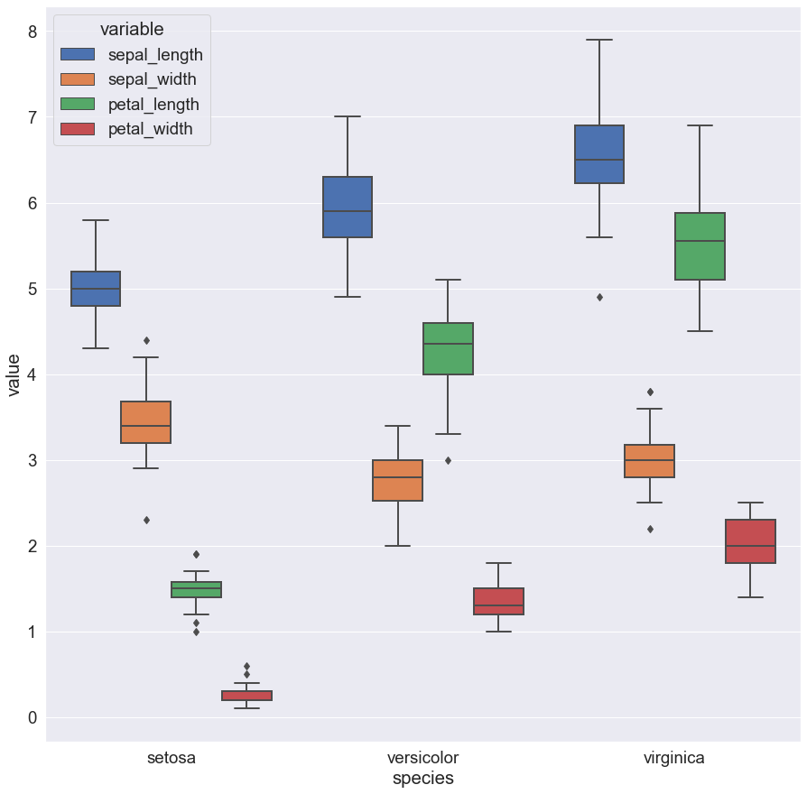
* 시각화 결과 EDA 해석)
- setosa 종의 경우 타 두 종에 비해 petal size가 width + length 모두 유난히 작음을 알 수 있다. 하지만 꽃받침(sepal)의 경우 길이는 상대적으로 작을지라도 너비는 타 두 종에 비해 작다고는 할 수 없음을 알 수 있다.
- setosa sepal width와 sepal length와의 차이가 versicolor & virginica 종에서의 width - length 차이에 비해 두드러지게 많이 남을 확인할 수 있다. (이는 setosa sepal width가 타 두 종의 width 보다 평균적으로 큰 size가 많이 분포해 있기 때문이다)
- virginica의 모든 네 항목 size는 versicolor에 비해 약간씩 큼을 알 수 있다.
2. What's Next?
≫ box plot과 유사하게 violin plot이 존재한다..! 다음에는 violin plot 시각화와 함께 box & violin의 특징 & 장단점 비교를 하려 함
'Visualizations > Various Graphs' 카테고리의 다른 글
| seaborn plots - displot, pairplot, regplot (8) | 2022.06.10 |
|---|---|
| Visualization - Graphs summarized (0) | 2022.05.02 |
| violin plot (+seaborn) (0) | 2022.03.27 |
| folium 시각화 (0) | 2022.03.24 |

댓글