* EDA에 대해 알아보았고 EDA 과정에서 많이 쓰이는 시각화 방법 중 box plot에 대해 자세히 알아보았다.
box plot (+seaborn)
* 저번 EDA 개념 포스팅에서 EDA가 무엇인지 알아보았고, data 종류별 & 상황별 적절한 시각화 예에 대해서 공부했다. https://sh-avid-learner.tistory.com/entry/EDA-Exploratory-Data-Analysis EDA - Explorat..
sh-avid-learner.tistory.com
** 이젠 box plot과 매우 유사한 형태인 'violin plot'에 대해서 알아보자!
→ box plot과 마찬가지로 violin plot도 unimodal distribution을 갖는 continuous variable의 경우 제일 적절하며 box plot과의 차이는 본래 box plot의 기본 구성요소에 'density' 데이터의 분포까지 보여준다는 장점이 있다.
"The violin plot, introduced in this article, synergistically combines the box plot and the density trace (or smoothed histogram) into a single display that reveals structure found within the data"
< box plot & violin plot 구성요소 비교 >
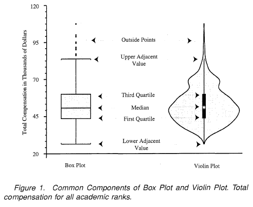
(the whiskers(box & violin의 내부 긴 라인들)는 95% 신뢰구간을 보여줌)
- 시각화 개요 -
※ data는 seaborn 내장 penguins data
※ 'body_mass_g' continuous variable & 'species' categorical variable 간의 관계를 한 개의 violin plot으로 시각화하고자 함!
(이 때 distribution 분포가 표현되며, hue값으로 'sex'를 집어넣어 'sex'기준 grouping하여 plotting)
※ 시각화 library는 seaborn 한정 사용!
(matplotlib vs. seaborn 포스팅 참조)
Seaborn vs Matplotlib
👏 정리 너무 잘해놓은 GeeksforGeeks 포스팅 글 그대로 발췌 👏 👐 Data Visualization is the graphic representation of data. It converts a huge dataset into small graphs, thus aiding in data analysi..
sh-avid-learner.tistory.com
※ set_theme()과 set() 메소드로 미리 setting
sns.set_theme(context='notebook', style='darkgrid', palette='pastel', font='sans-serif', font_scale=5, color_codes=True, rc=None)
sns.set(rc = {'figure.figsize':(6,6)}, font_scale=1.3)
1. violin plot (using seaborn) - visualization
◑ seaborn - violin plot docu ◑
https://seaborn.pydata.org/generated/seaborn.violinplot.html
seaborn.violinplot(*, x=None, y=None, hue=None, data=None, order=None, hue_order=None, bw='scott', cut=2, scale='area', scale_hue=True, gridsize=100, width=0.8, inner='box', split=False, dodge=True, orient=None, linewidth=None, color=None, palette=None, saturation=0.75, ax=None, **kwargs)
"Draw a combination of boxplot and kernel density estimate. A violin plot plays a similar role as a box and whisker plot. It shows the distribution of quantitative data across several levels of one (or more) categorical variables such that those distributions can be compared. Unlike a box plot, in which all of the plot components correspond to actual datapoints, the violin plot features a kernel density estimation of the underlying distribution(이게 box plot과 차이점). This can be an effective and attractive way to show multiple distributions of data at once, but keep in mind that the estimation procedure is influenced by the sample size, and violins for relatively small samples might look misleadingly smooth. This function always treats one of the variables as categorical and draws data at ordinal positions (0, 1, … n) on the relevant axis, even when the data has a numeric or date type."
(box plot에서 다루지 않은 인자들만 - violin plot 특유 parameters)
→ split) hue 인자를 통해 nested된 data에 한해서, violin 양쪽에 갈라진 (동일한 x축 기준 하에) 다른 분포가 오게 설정 (하단 그림 참고)
(단, hue level은 2개만 허용! - 2개 변수) "When using hue nesting with a variable that takes two levels, setting split to True will draw half of a violin for each level. This can make it easier to directly compare the distributions."
→ order & hue_order) 정해진 order를 통해 violin의 순서를 조정할 수 있다. (hue 역시 마찬가지) "Order to plot the categorical levels in, otherwise the levels are inferred from the data objects."
→ scale) default는 'area'로 모든 violin의 면적이 같게 설정된다. 'width'라면 너비가 같게 설정되며, 'count'면 각 violin의 넓이, 너비가 통일됨에 관계 없이 해당 관측치가 높고 낮음에 따라 violin scale이 결정됨! (count 추천) "The method used to scale the width of each violin. If area, each violin will have the same area. If count, the width of the violins will be scaled by the number of observations in that bin. If width, each violin will have the same width."
→ scale_hue) 'this parameter determines whether the scaling is computed within each level of the major grouping variable (scale_hue=True) or across all the violins on the plot (scale_hue=False)' scale로 설정한 scaling이 hue level 가르는 주요 변수에만 적용할 지, 아니면 plot의 모든 violin에 적용할 지 설정하는 인자 (즉, scale_hue=False로 설정하면 옆 violin에 상대적인 값으로 분포가 나온다)
→ inner) 'Representation of the datapoints in the violin interior. If box, draw a miniature boxplot. If quartiles, draw the quartiles of the distribution. If point or stick, show each underlying datapoint. Using None will draw unadorned violins.' 원래 violin plot에서 나온 수치요약은 default로 'box'이지만 'quartile', 'point', 'stick' 등 다양하게 data를 표현 가능
→ bw) 'Either the name of a reference rule or the scale factor to use when computing the kernel bandwidth. The actual kernel size will be determined by multiplying the scale factor by the standard deviation of the data within each bin' bw값 조절 - 분포 폭 조절
→ dodge) 'When hue nesting is used, whether elements should be shifted along the categorical axis.' hue로 grouping된 값들이 nested되지 않고 각 violin plot대로 나온다는 뜻
* 반환형) violin plot ax객체
ex) 위 penguins dataset을 집어넣어 violinplot 표현
sns.violinplot(x='species',y='body_mass_g',data=pp,hue='sex',split=True,palette='husl',bw=0.3);

* 시각화 결과 EDA 해석)
≫ Adelie 종과 Chinstrap 종은 Male과 Female 모두 각각 body_mass_g 수치가 거의 비슷
≫ Gentoo 종의 경우 남성과 여성 모두 무게가 타 두 종에 비해 월등히 많이 나감을 육안으로 확인할 수 있다
≫ Chinstrap 종은 남성과 여성 모두 body_mass_g의 분포가 타 두 종에 비해 더 넓게 분포 되어있음을 확인 가능하다
≫ 가장 분포가 많이 되어 있는 body_mass_g를 따지면 Adelie가 Chinstrap 종에 비해 살짝 더 높게 측정된다
'Visualizations > Various Graphs' 카테고리의 다른 글
| seaborn plots - displot, pairplot, regplot (8) | 2022.06.10 |
|---|---|
| Visualization - Graphs summarized (0) | 2022.05.02 |
| box plot (+seaborn) (0) | 2022.03.25 |
| folium 시각화 (0) | 2022.03.24 |

댓글